In this article:
Overview
Flow usage charts give you valuable insight into what is happening with your flows across all of your integrations. With this feature you can quickly see which flows have executed successfully, which have failed due to errors and those that have been skipped.
Customers can also break this data down to time periods over days, weeks and months to get clear visibility of trends in their Flow executions.
Viewing Flow Usage Charts
When you log into the Chain.io portal and follow the link to your Workspace, you will now see a Flow Usage chart at the top of the view above your Integration and Tasks lists.
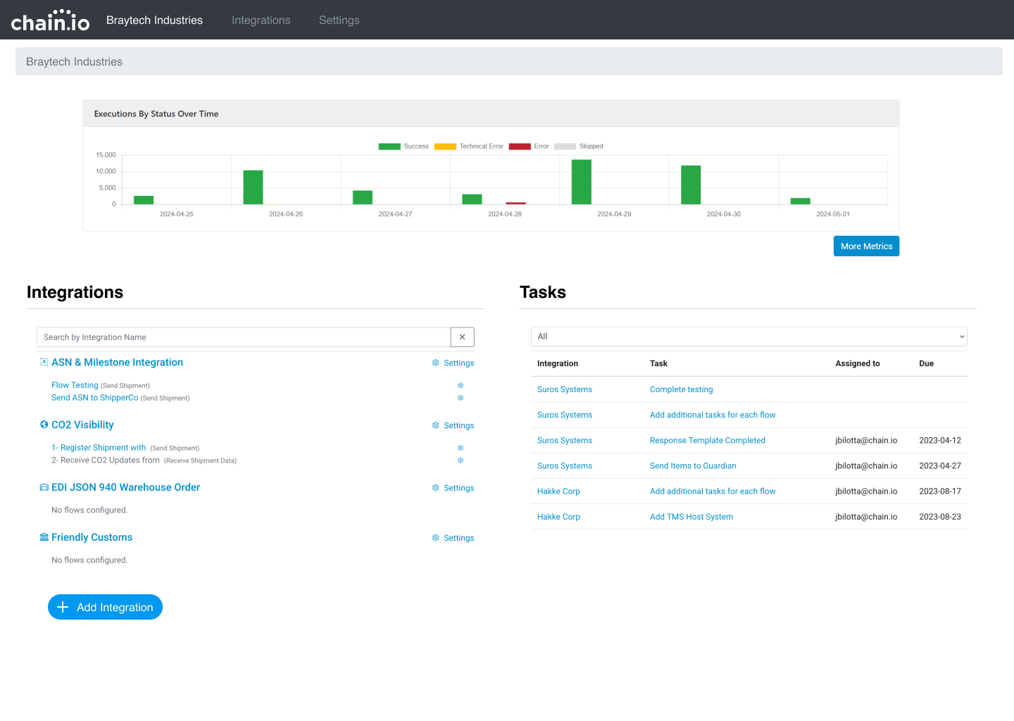
This chart displays Flow Executions by status over the last week. Click on the items in the legend to toggle the visibility of the information. To access the other chart metrics you can click the button labeled More Metrics.
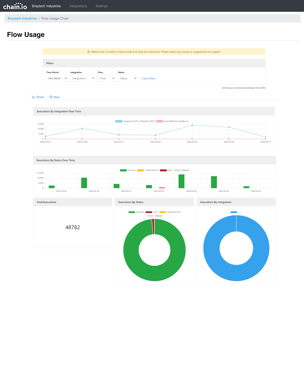
On the following screen you will see a comprehensive display of Flow Usage across all of your Integrations within this workspace.
Filters
At the top of the view customers have control over the criteria of the data displayed by using the Filters. Customers can view data by time period viewing data down to the day. They also have the ability to choose specific Integrations and Flows to get a more focused view of activity. Finally customers can just filter their data on the Flow status.
Charts and Data
The Charts tab displays the Flow data based on the Filter criteria above. These charts include the following:
Executions by Integration Over Time
This chart displays information about the amount of executions being performed by your Flows by Integration. Integration names are displayed in the key above the data. This information gives customers a comparison of their Integration performance and a look into which Integration are more or less active.
Executions by Status Over Time
This chart displays information about the status of your collective Integrations and shows how many successes, skips and failures have occurred over a period of time. By default this time period is the last seven days, however this can be adjusted using the Filters at the top of the view.
Total Executions
This is the total number of Flow Executions performed by your integrations
Executions by Status
This doughnut chart displays the total number of Flow Executions by Status
Executions by Integration
This doughnut chart displays the total number of Flow Executions by Integration within your Workspace
Data Tab
The Data tab displays the information used to display the charts but in tabular form.
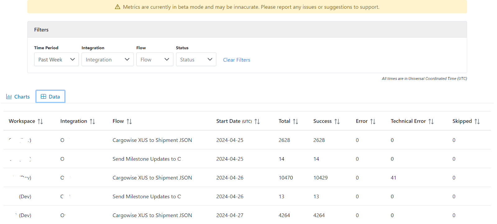
Customers can sort this data in the table to suit their needs. All data displayed can be broken down using the Filters at the top of the view, just like the charts.
Downloads Tab
The downloads tab gives you the option to download your data in Excel (XLSX) or Comma Separated (CSV) format. When you click either download button, the download will contain the data currently visible on the Data tab including the results of any filters you have set.
In the Excel version, the Workspace, Integration, and Flow fields contain hyperlinks to jump directly to the appropriate page in the portal.
Was this article helpful?
That’s Great!
Thank you for your feedback
Sorry! We couldn't be helpful
Thank you for your feedback
Feedback sent
We appreciate your effort and will try to fix the article